
Virtualight Redesign
The problem with being a webdesigner is that you’re too busy designing other people’s websites to do your own and it’s not like you can have somebody do it for you. No, you've got to design it yourself and then the pressure starts to mount: It’s got to look good; it has to be maintainable and it has to have lots of bells and whistles without being too blatant about it.
I think I’m on the fifth version of the Virtualight website, and this is the first one that doesn’t use either frames or Flash and is pretty much driven by cascading style sheets. It definitely doesn’t have the sex appeal of my earlier websites with Flash menus and technopop musical accompaniment.
This website does, however, have a few bells and whistles and I will start documenting them, partly because I want to brag but mostly because if I don’t write it down, I’ll forget how everything works. I am, in fact, miserable at understanding my own (or anyone else’s code). I can come back to my code after a week spent doing other things and not recognize anything.
Anyway, there are several features of this website that I will examine, including centered content, user-defined content width, page navigation, drop-down navigation and transparency. But first, an apology to the Internet Explorer 6 users who aren’t reading this because I directed them to a get IE7 page. I’d like to create a stripped down IE6 version of the site, but it’s unlikely I’ll get around to it. I had hoped that the greate ie7.js script would let the site work under IE6, but there are too many issues.
Centered content
Computer displays keep getting bigger but many designers still haven’t acknowledged this, and so you see websites with fixed-width content that is left aligned. Or worse, websites without a fixed width that have content free to go the width of the browser window.
I’ll admit the center alignment is just a personal preference, especially if you have a wide display. It’s just lonely looking to have all your content shoved to the left with a wide-open expanse on the right. I think it’s better to balance the left and right sides. (Of course, if you never fix the content width the content is always centered.) Most websites do fix the content width, usually with an eye to most common screen display dimensions.
(Incidentally, Amazon.com does a good job of accomodating wide screens. As you increase the width of the browser, you can see more items displayed. It doesn’t, however, change the way text is displayed.)
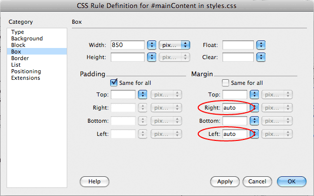 The basic trick is to set the content width and then set the left and right margins of the body or main content containers to auto. Most designers will probably do this to a div subordinate to the body tag, rather than redefining the margins of the body tag. Using a “mainContent” div gives you a little more flexibility later in the design.
No free range text
But content that’s allowed to run too wide is a different matter. It’s very hard to read type that’s set too wide, something I learned back in journalism school, where I was taught this rule of thumb: type should be set wider than the typesize in picas and narrower than two times the typesize in picas. In other words, 10-point type should not be set less then 10 picas  wide or wider than 20 picas wide.
This makes perfect sense if you’re a typographer, but for those of you who aren’t, here’s a more modern rule: type width should be wider than 12 times its typesize in pixels and less than 24 times its typesize in pixels. In other words, 10 pixel tall type should be set between 120 and 240 pixels wide.
Now, these are just rules of thumb: some thumbs are bigger than other and these rules come from newspaper design. Find your own rules to govern your design and here’s a clue, if you get lost where you are when you’re reading, it’s probably set too wide.
To get around the wide text problem, I’ve added user definable columns to the story pages. I’ll be writing up how that’s achieved soon. And I’ll probably bring this feature to the home page and landing pages, once I actually have enough content to justify it.
From scrolls to books to scrolls
It’s like we’ve gone from reading scrolls, evolved to books and devolved back to scrolls. I like having a fixed navigation menu. I’m really annoyed when I have to scroll back to the top of a page to hit next or read another story. I used to accomplish this with frames, but I’ve decided to go with a menu div that has position:fixed. I know that position:fixed doesn’t work on IE6, but I’ve already addressed that issue.
Drop down menu on click
Ever gone to a website on a morning when you haven’t had enough coffee and been unable to keep your mouse poised over the drop-down menu? Every time you stray off course, the menu disappears. I hate that so I created a drop-down menu that works on click, just like your computer’s operating system’s menus.
Page-based navigation
Back to my rant about scrolls: Have you ever lost your place in a long story? It seems every time I scroll or page down, I have to find my place. Because I’m old. You young whipper snappers don’t have this problem, with your texting and your twitting and your social networking. But I do, so I created a page-based display. Like in a book.
Admittedly, I had to make a few compromises. I force the reader to set the number of columns, number of lines and the font size. But the reward is when you hit next, you know exactly where you are. And, a cookie remembers where you were when you return to the story. I’ll be writing an article about this feature next, because I can already feel my memory slipping away.
Transparency
I love transparency. Those drop shadows look so neat and it gives a very nice effect if you do have to scroll one of the pages on this website. Look under the menu and you can see the soft blur over the text, rather than a hard line cutting off the text. I love that. Only thing, it requires transparent PNGs, which don’t work in IE6. (Yes, ie7.js does partially solve this problem, but won’t work for background graphics.)
Anyway, I’d love to hear your thoughts about this site’s design considerations, but I haven’t gotten around to setting up a forum or blog yet. As soon as I do, please feel free to post your thoughts.
